FINGER CROSSED DATING APP
OVERVIEW
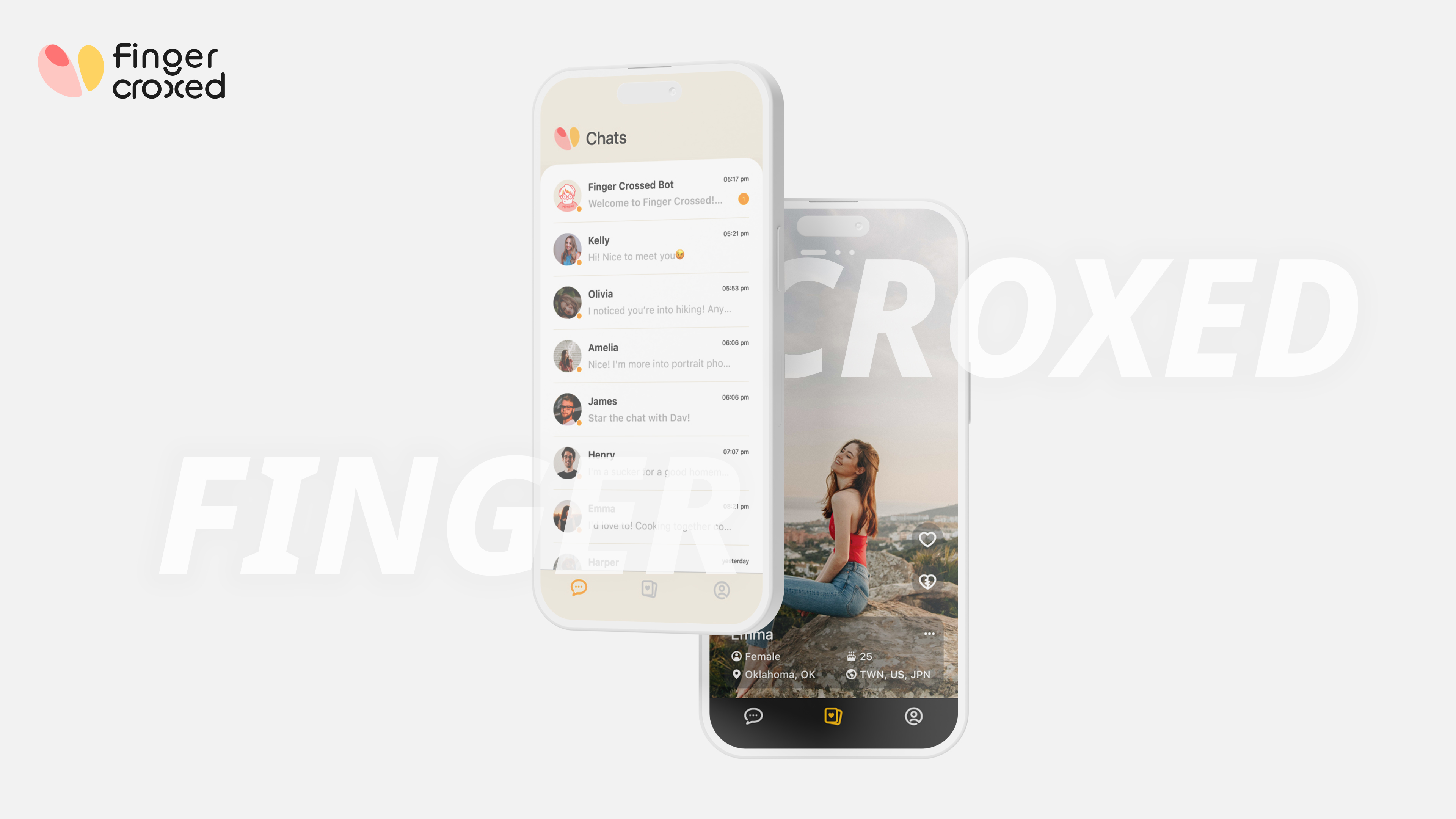
Finger Crossed is a dating app crafted to unite individuals from diverse cultural backgrounds, facilitating the discovery of their ideal match. Our inspiration for this endeavor stemmed from recognizing the hurdles international students often encounter in building connections, owing to their distinct traditions, life experiences, and languages. By incorporating innovative features and creative strategies into the Finger Crossed application, our goal is to break the boundaries between the differences, expand their horizons, and welcome fresh experiences.
Product type
Dating APP / iOS
Duration
2023
Role
UX Researcher / Designer
Delivery
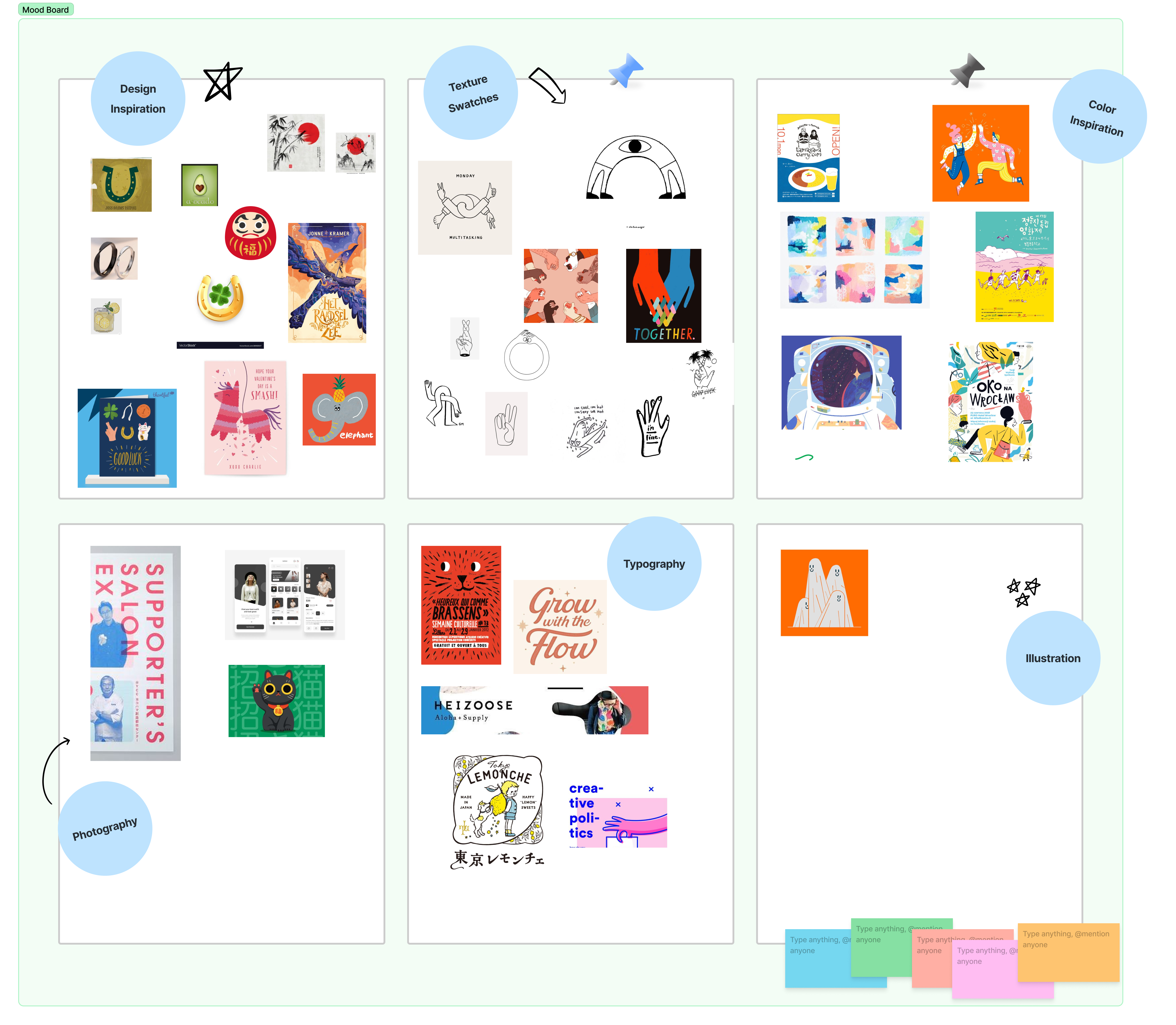
Mood Board / Competitor Analysis / Survey / UX Interview / Wireframe / Prototype / Usability Testing / User Interface / Design System
Why Finger Crossed 🤞🏻 ?
With unwavering enthusiasm, we aptly named our app "Finger Crossed" to encapsulate the essence of our mission. We believe in the power of serendipity and the magic that happens when paths intersect. Our app is a beacon of hope, bringing together individuals from all walks of life, crossing their fingers for destiny to weave its enchanting web
What's different
Survey
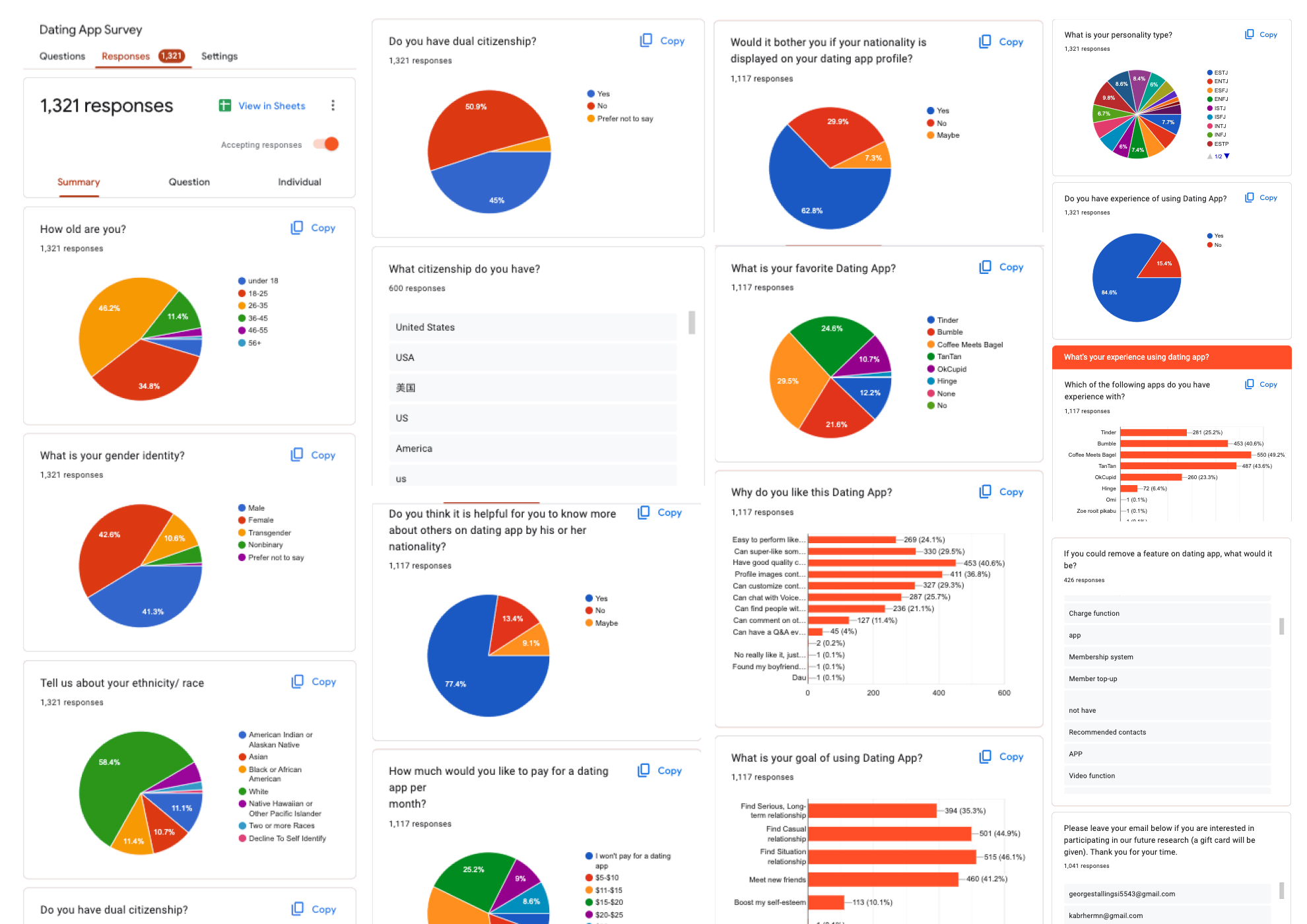
Through our survey efforts, we received a total of 1,321 responses, allowing us to gather both qualitative and quantitative insights. This encompassed user demographics, preferences towards dating applications, and their experiences with using such platforms. These valuable findings enable us to address the specific needs of particular user segments effectively. Additionally, they aid in narrowing down potential competitors, facilitating the execution of subsequent competitor analyses and market positioning.
Competitor Analysis
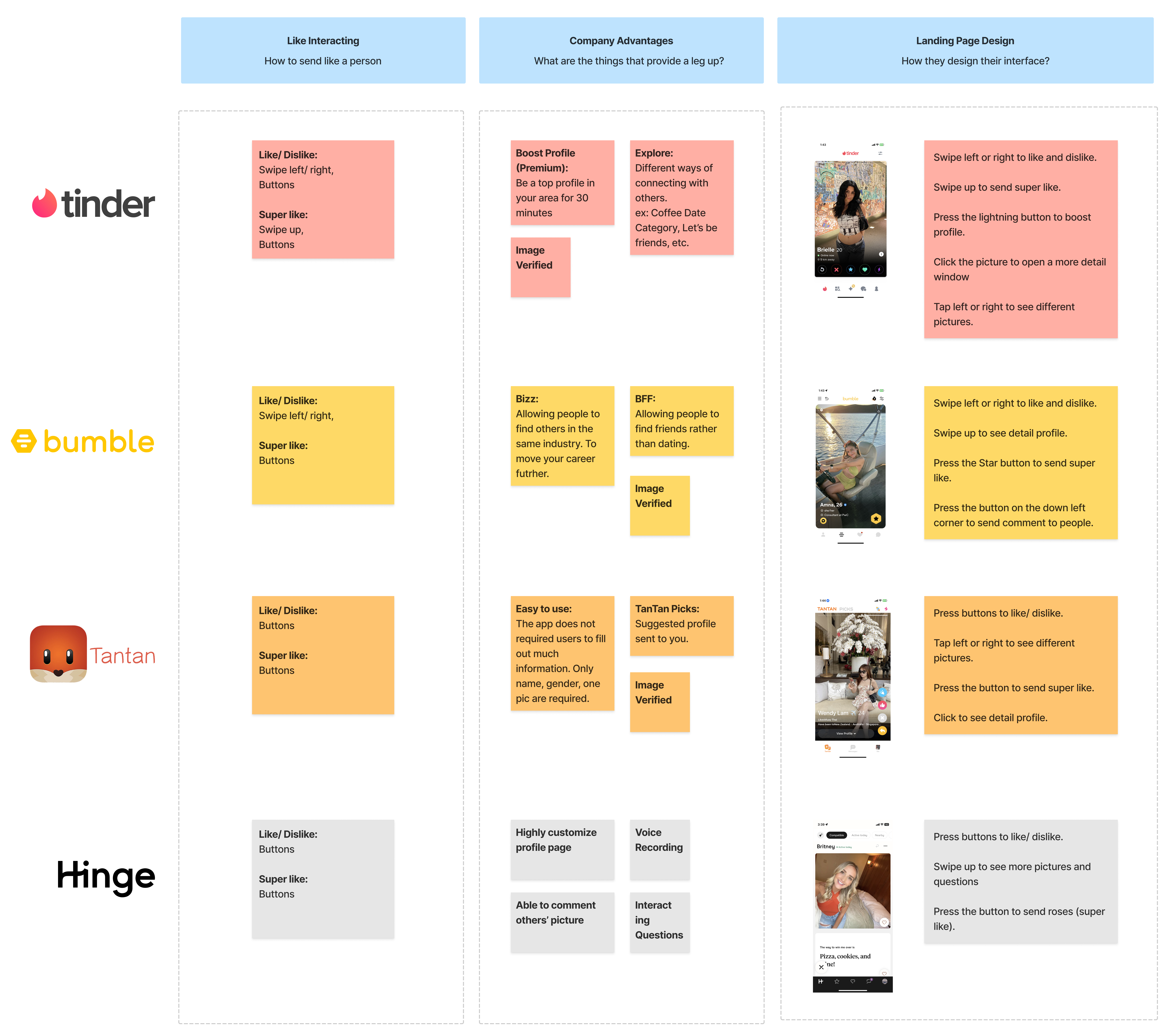
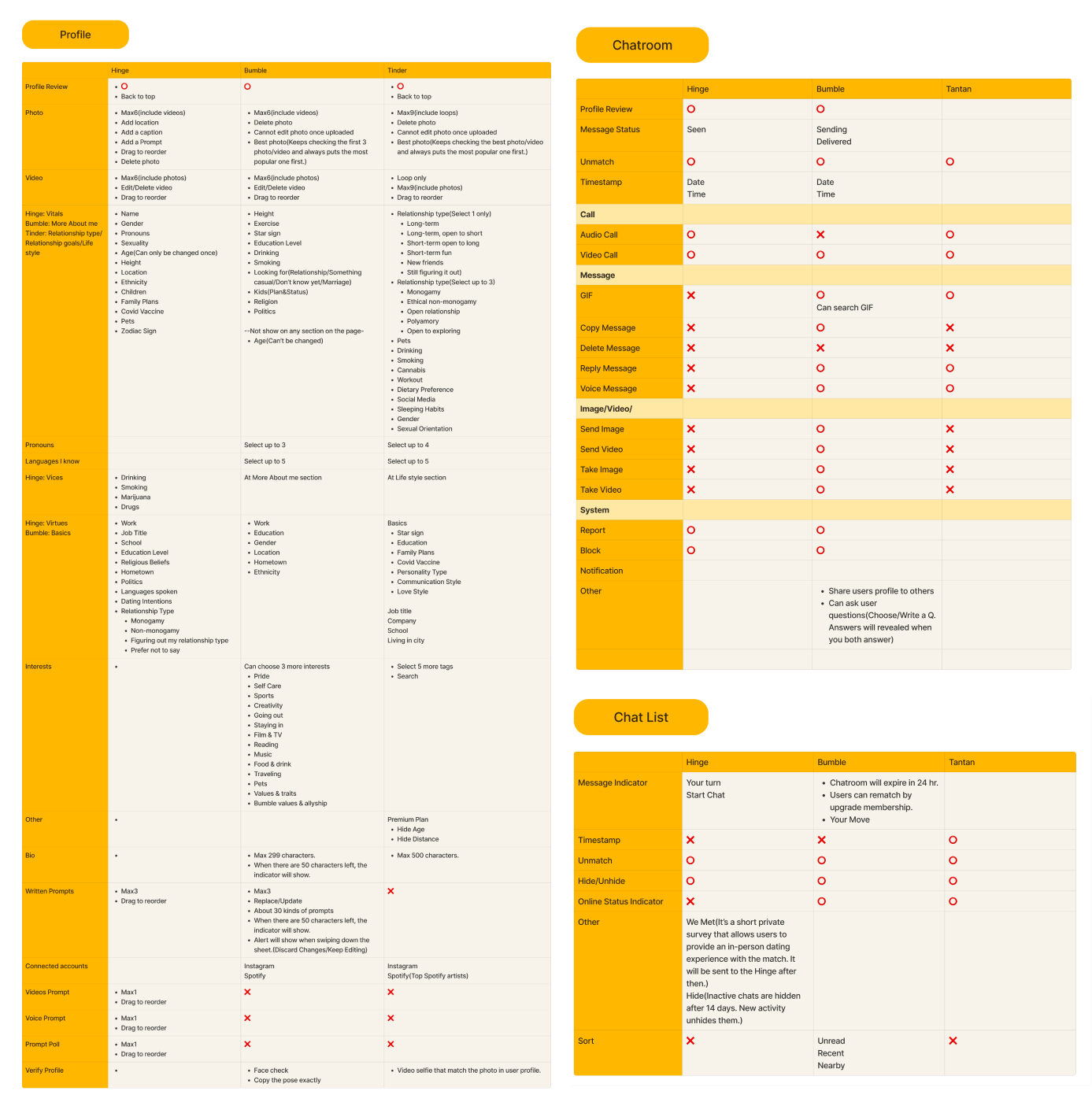
After analyzing the survey data, we have narrowed our competitors down to Tinder, Bumble, TanTan, and Hinge - the top four favorite dating apps among participants. We have proceeded to scrutinize their strengths and weaknesses, the features they offer, as well as user interactions with their products.
Interviews
To gather supplementary information, we reached out to randomly selected individuals who have already completed the survey. Through interviews, our objective is to delve deeper into their thoughts and perspectives, potentially revealing additional insights.
Research Wrap up
After conducting the research, it was found that 83% of participants were open and interested in dating individuals from diverse cultural backgrounds. Among them, 40.6% considered the richness and customizability of user profiles as the key factors influencing their preference for this dating app. Additionally, the user-friendly interface that allows tasks to be easily accomplished with one hand is deemed essential. We translated these insights into concrete solutions, into solutions; the application's core features include:
- A filter to assist users in locating potential matches from specific cultural backgrounds.
- A highly customizable profile system, offering features like voice messages, image captions, flexible image arrangement, and more.
- An intuitive interface incorporating gestures designed for seamless app interaction.
Design
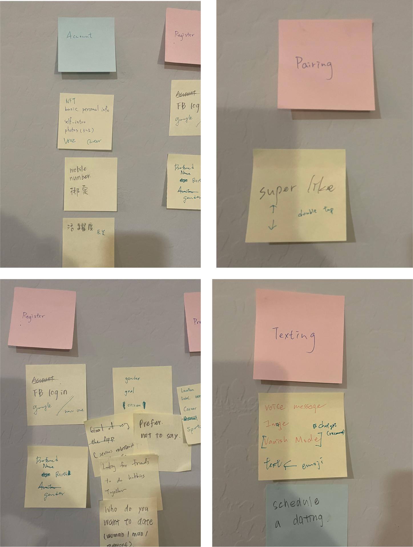
Information Architecture
Wireframes
Design System
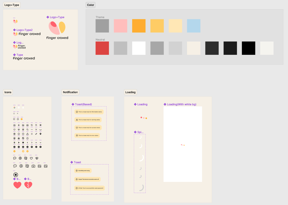
A design system includes color schemes, typography, iconography, UI patterns, and more, with the aim of enhancing the brand message in a comprehensive and distinctive manner.
Prototyping
Coming soon
Optimization
Nationality & Ethnicity Filter
Coming soon
Profile Content
Coming soon
Testing
01 Sign Up Flow
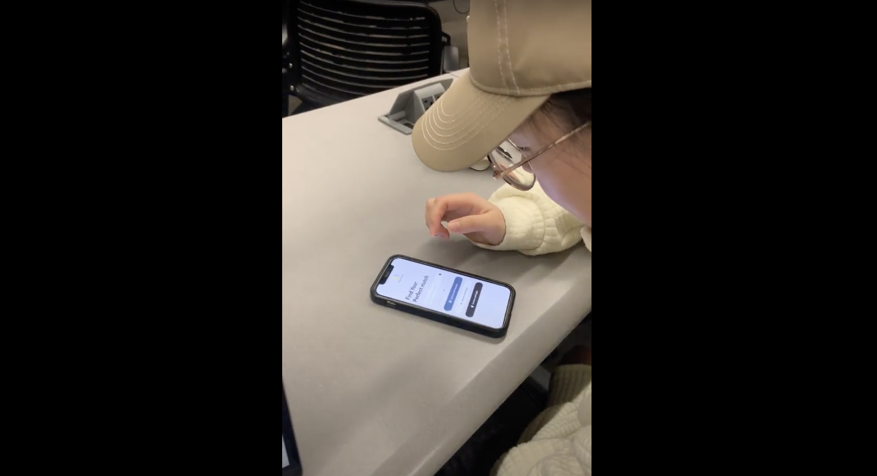
02 Paring Flow
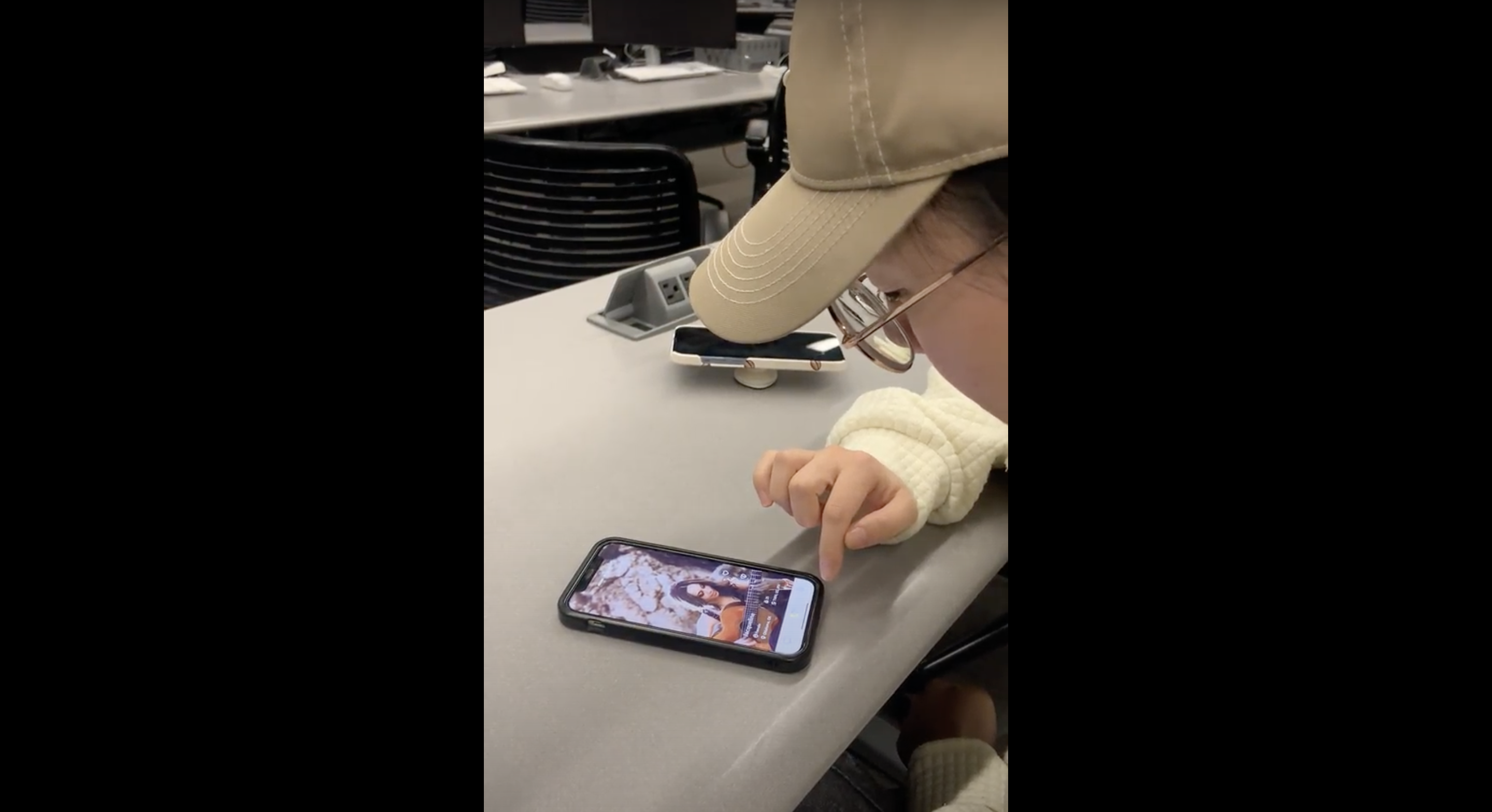
03 Profile Flow
