Roche Knowledge Base System
OVERVIEW
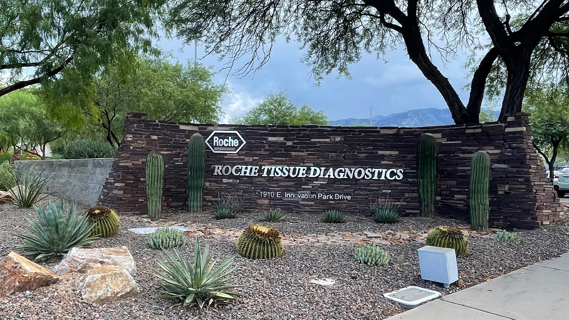
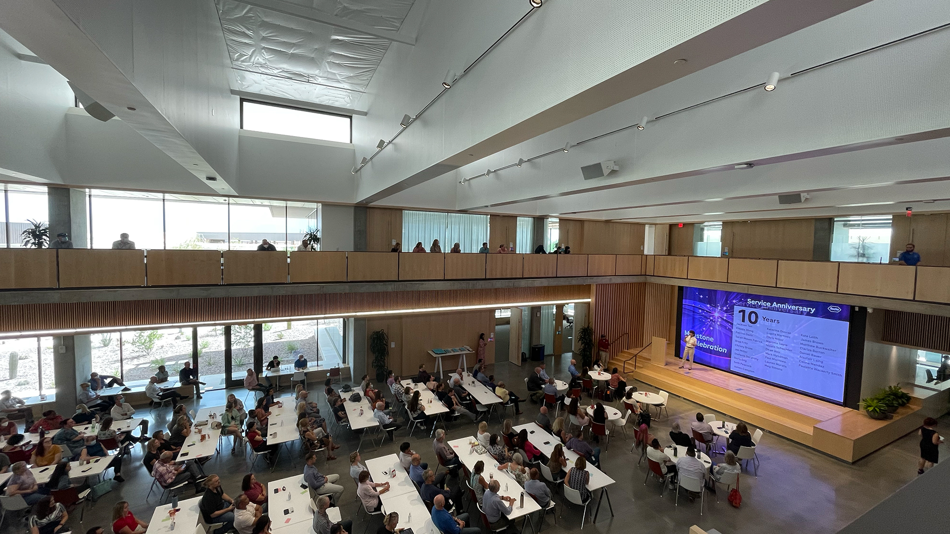
I’ll never forget the sunset in Tucson.
Roche is a medical device company that develops, manufactures, and markets instrument reagent systems for slide staining in anatomic pathology labs.
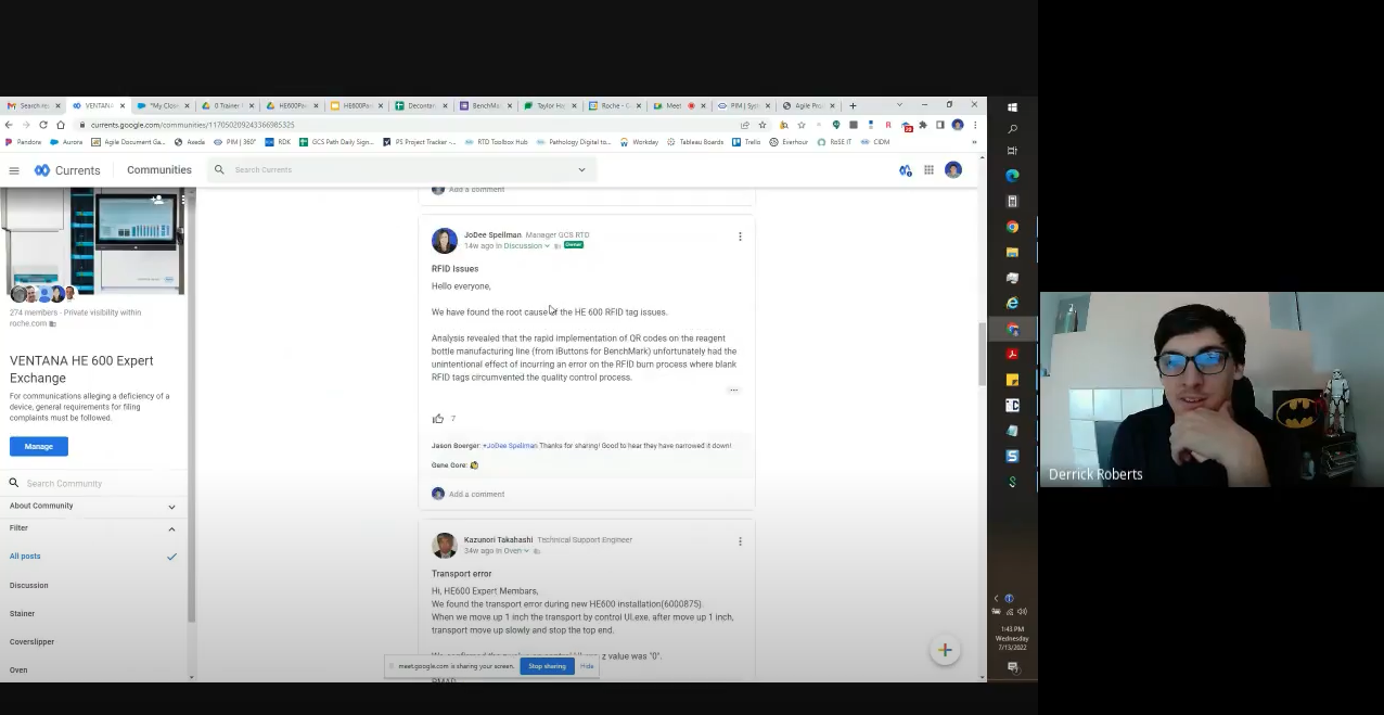
As part of the Global Customer Service (GCS) team, I supported local and regional representatives around the world. During my internship, I improved accessibility and findability in the RDK knowledge base system by conducting user interviews and questionnaires with GCS team members. This project aimed to identify Field Engineers’ pain points and provide recommendations for future improvements.
Product type
Knowbase system / Troubleshooting
Duration
2022
Role
User Research Intern@Global Customer Support
Delivery
UX Interview / Card Sorting / Technical Report
Preparation
User Research Plan
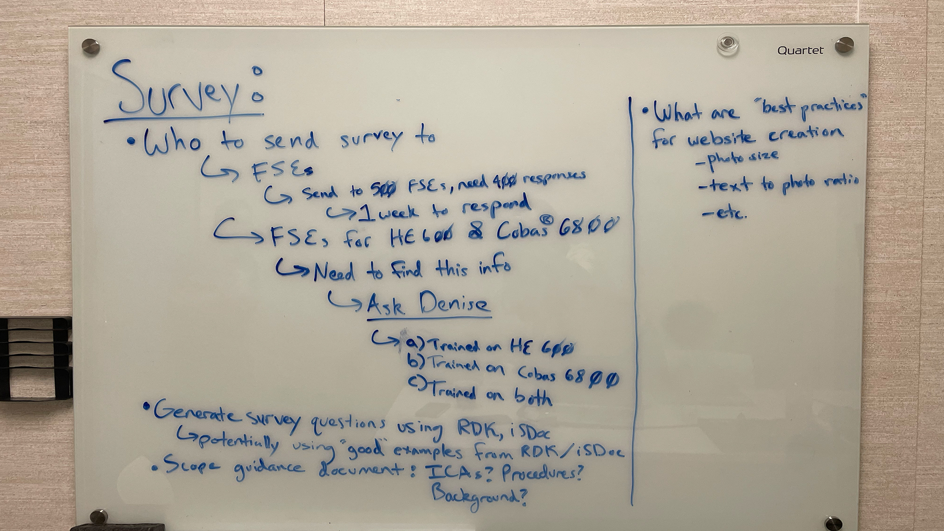
Preparation is the key to success. Our team held several meetings to define the research scope, methodology, target participants, and related materials to ensure a smooth process.
Research and Data Analysis
Questionnaire and User interviews
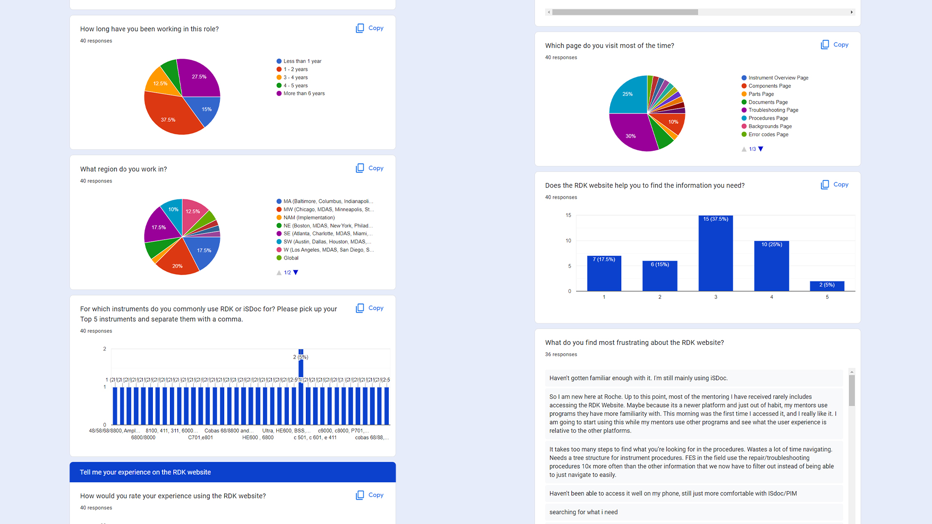
One unexpected challenge was participant recruitment. To find suitable Field Engineers as participants, we collaborated with training specialists and field managers across the USA. Despite this hurdle, we received over 500 questionnaire responses and successfully recruited participants for a field study.
Data Analysis
Through qualitative research and closely observing how Field Engineers interact with the RDK system, we visualized quantitative data to understand user preferences and behavior patterns. Using card sorting, we categorized issues that hinder engineers from achieving their goals, enabling us to identify key obstacles and prioritize solutions.
Solution
HOW DO WE improve accessibility and efficiently
Due to confidentiality under a Non-Disclosure Agreement, I am unable to provide the associated visuals for this explanation. I appreciate your understanding on this matter.
What'd we do?
Redesigning the Mobile Version
Field engineers often work in tight spaces and rely on mobile devices for quick access to information. Improving the mobile experience was a priority to ensure that engineers could navigate the system efficiently while on-site. Usability testing on mobile devices should be conducted in the next iteration to reveal further issues.
What'd we do?
Optimizing Image Management in CSS
By applying specific weight and position values in CSS for images, we ensured consistency in size and layout. For instance, setting a weight of 600px provided an optimal image size for laptop users, enhancing the reading experience.
What'd we do?
Promoting the RDK Offline Version
Many engineers were unaware of the RDK’s offline capabilities. Raising awareness and providing clear instructions on how to use this feature would support engineers working in areas with unreliable internet connections.
What'd we do?
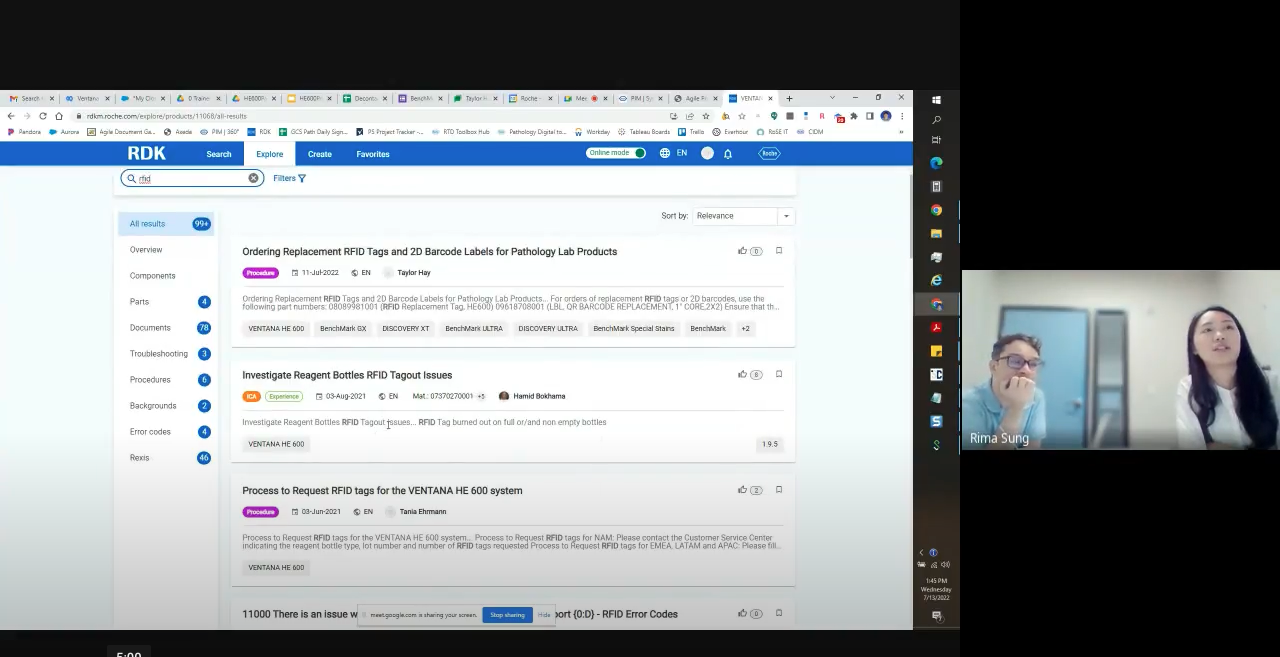
Improving the Search Engine
Irrelevant search results hindered users’ ability to find information. While improving the search algorithm is important, better navigation proved to be a more effective solution. By organizing content into intuitive categories, users could quickly navigate without needing to formulate perfect search queries.
What'd we do?
Making the Filter Function More Visible
The filter function, currently available only on the results page, should be placed beside the search box on every page to increase discoverability and usability.
What'd we do?
Redesigning the Information Architecture
The disorganized structure of the RDK was a major pain point. I recommended reorganizing content into clear sections and introducing a streamlined navigation system to reduce the number of pages users needed to search through to find relevant information.
What'd we do?
Providing Simple Onboarding Instructions
A simple onboarding guide would help new users navigate the platform, reducing the learning curve. By offering clear instructions on how to use key features, users could become proficient more quickly, even before attending formal RDK training sessions.
Reflection
This project honed my skills in conducting UX research, analyzing user feedback, and delivering impactful design recommendations. It showcased my ability to collaborate across teams, manage participant recruitment, and provide strategic, data-backed solutions to real-world challenges.
