URCOSME WEBSITE
OVERVIEW
UrCosme (@cosme) is the premier cosmetics social community that enables beauty enthusiasts to share their reviews on over 100k+ product pages. This data serves as a reliable reference for consumers making purchases online, in brick-and-mortar stores, or at @cosme physical stores. The project aims to optimize the browsing experience to encouraging users to seamlessly transition between online and offline shopping.
Product type
B2C / Social Media / User Generated Content Platform / RWD
Duration
2017 - 2018
Role
UX/UI Designer
Delivery
UX Interview / User Journey / User Story / User Flow / Hi-fi Prototyping / Branding / Design System
ACHIEVEMENTS
I spearheaded initiatives to optimize the browsing experience, leading to a substantial increase in user engagement. I successfully streamlined navigation across 100k+ product pages, resulting in a significant boost—both a notable uptick in online user activity and a marked increase in the conversion of online users to offline customers. This achievement is reflected in a quantifiable rise of 42% in web traffic and 60% growth in the transition from online to physical @cosme stores, highlighting the impactful outcomes of my design contributions.
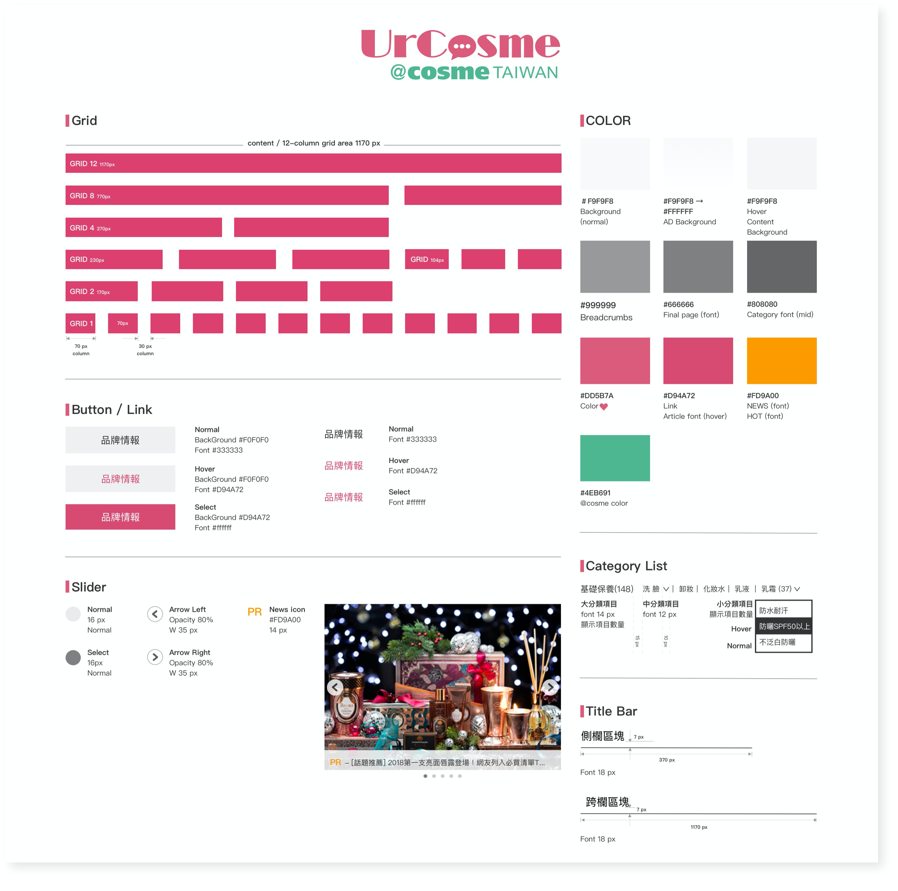
Systematized design patterns and styles for a responsive website
Purchase intention increased
Web traffic boosted
New user creations in 6 months
DISCOVER
Understanding consumer shopping behavior
We conducted a focus group with four heavy users on the website to delve into their online shopping journey. We observed they used to visit the UrCosme website for searching product information before purchasing. Some of them search product reviews on mobile phone at the physical retail store before check out.
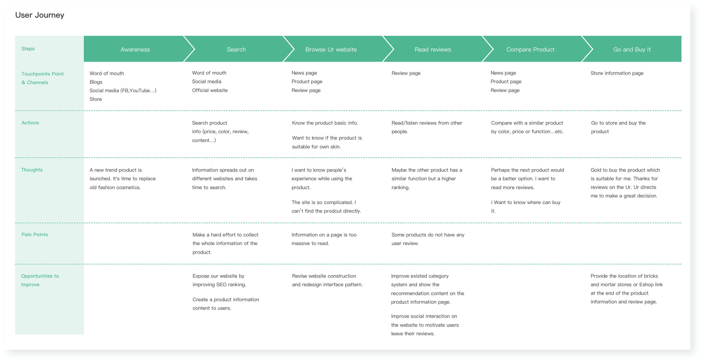
To clarify the gap between users' goals and services, we drew a user journey map to emulate the user’s feelings and explore their pain points when they before, during, and after purchasing a product.
Challenge
How do we keep users to stay on the site?
We've noticed that users face challenges in taking additional steps, like finding details about physical store locations for product purchases, after reading reviews. Moreover, many users leave the site to search for information elsewhere when they can't find the product, leading to an increase in bounce rates. So, how do e keep users to stay on the site?
Solution
Reconstruct information architecture
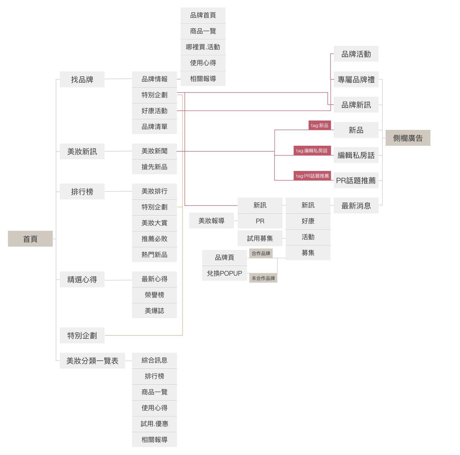
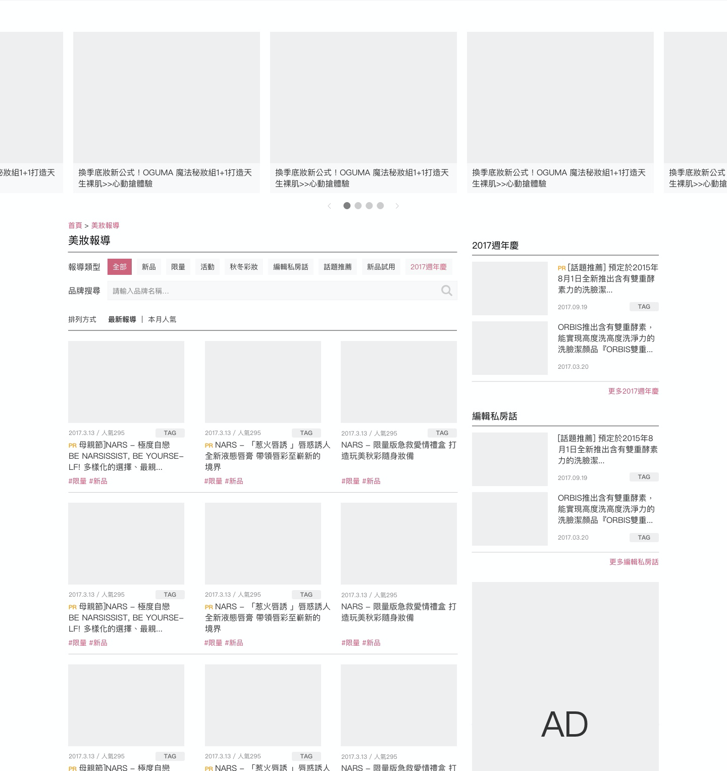
We conducted card sorting to reorganize information architecture on the site. Thus, users can reduce the time for searching and finding a product intuitively. We apply the iterative work method in the project. There are five testing phases from the wireframe to the interactive prototype.
Challenge
How do we encourage offline customers to become online users
Urcosme is a user-generated content (UGC) platform that encourages online users to share reviews of beauty products, aiming to inspire others to make purchases. Essentially, individuals who have bought a product offline become potential online contributors by sharing their experiences and influencing prospective buyers. But, how to make offline users become online users?
Solution
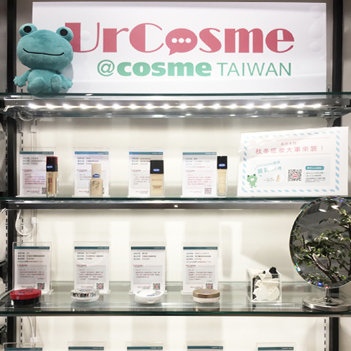
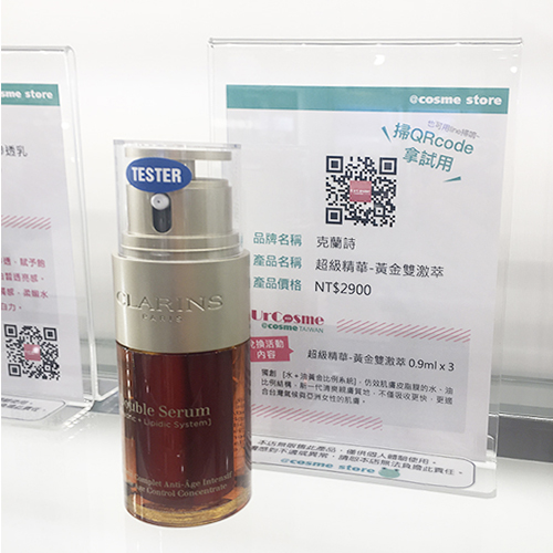
Exposure the website through QR code
We placed a QR code and user comments on the product label, both on the shelf and digital board. The QR code facilitates a quick link to the product page, allowing customers to access comprehensive product information instantly when scanned. This approach not only enhances the customer experience but also attracts new customers to our website. Based on the data, over 70% of users visit the site via the QR code, leading to a noticeable increase in product sales.
DESIGN REVIEW
