World Vision International (Taiwan)
OVERVIEW
World Vision International(WVI) is a global humanitarian organization that aims to support local communities and children by providing food and shelter through sponsorship. The global team released an update to enhance user experience, leading to increased online donations. However, the Taiwan team noticed varied donation habits between Asians and Westerners. To address this, our goal is to identify and accommodate these differences by creating an Asia-friendly version of the website.
Product type
Non-profit / E-commerce / RWD
Duration
2020 - 2021
Role
Lead UX/UI Designer
Delivery
UX Interview / Cognitive Walkthrough / User Story / User Flow / Information Architecture / Wireframe / Prototype / User Interface / Design System
ACHIEVEMENTS

Executed 16 Agile sprint iterations

Boost in online donations

50% increase in annual company revenue

Created 200 Pages for mobile and desktop
CHALLENGE
Limited budget for research
We recommended implementing UX research methods to collect user data in our initial stakeholder meeting. Usability testing is one of the recommendations. However, the stakeholders declined this suggestion since it is too expensive and time-consuming.
Approach
Cognitive walkthrough & Open sources
In fact, the WVI system has recorded some user data that can provide insights into users' demographics or donation preferences. Also, many free outsources on the internet. Some papers about what factors impact users' donation increases that really help with the decision-making process.
Inital UX Meeting
Cognitive walkthrough
Open sources
DISCOVER
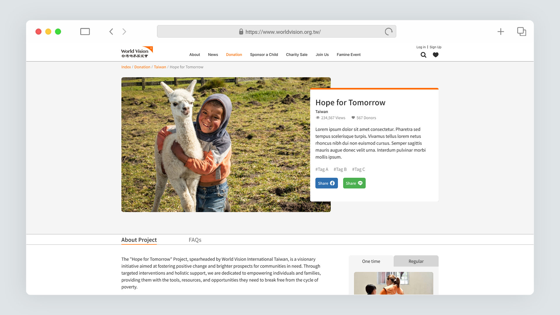
What happens to donation experience?
I invited 3 stakeholders to join in a cognitive walkthrough activity to walk through each step of the donation flow to reveal usability issues that could be challenging to new and existing users.
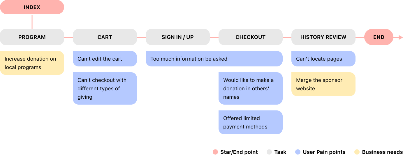
After we understand user pain points on the site, we created new user flows on the site based on user stories. By doing so, we documented a project and sprint backlog to provide a big-picture view and long-term planning for our team members.
Solution
HOW DO WE INCREASE DONATION INTENTION?
From our findings, we've noticed that users are bouncing off tasks because the information on the site is too complex, and they feel they have limited control over the donation process. These insights have guided us to come up with three solutions geared towards creating a more user-friendly experience on the website:


What'd we do?
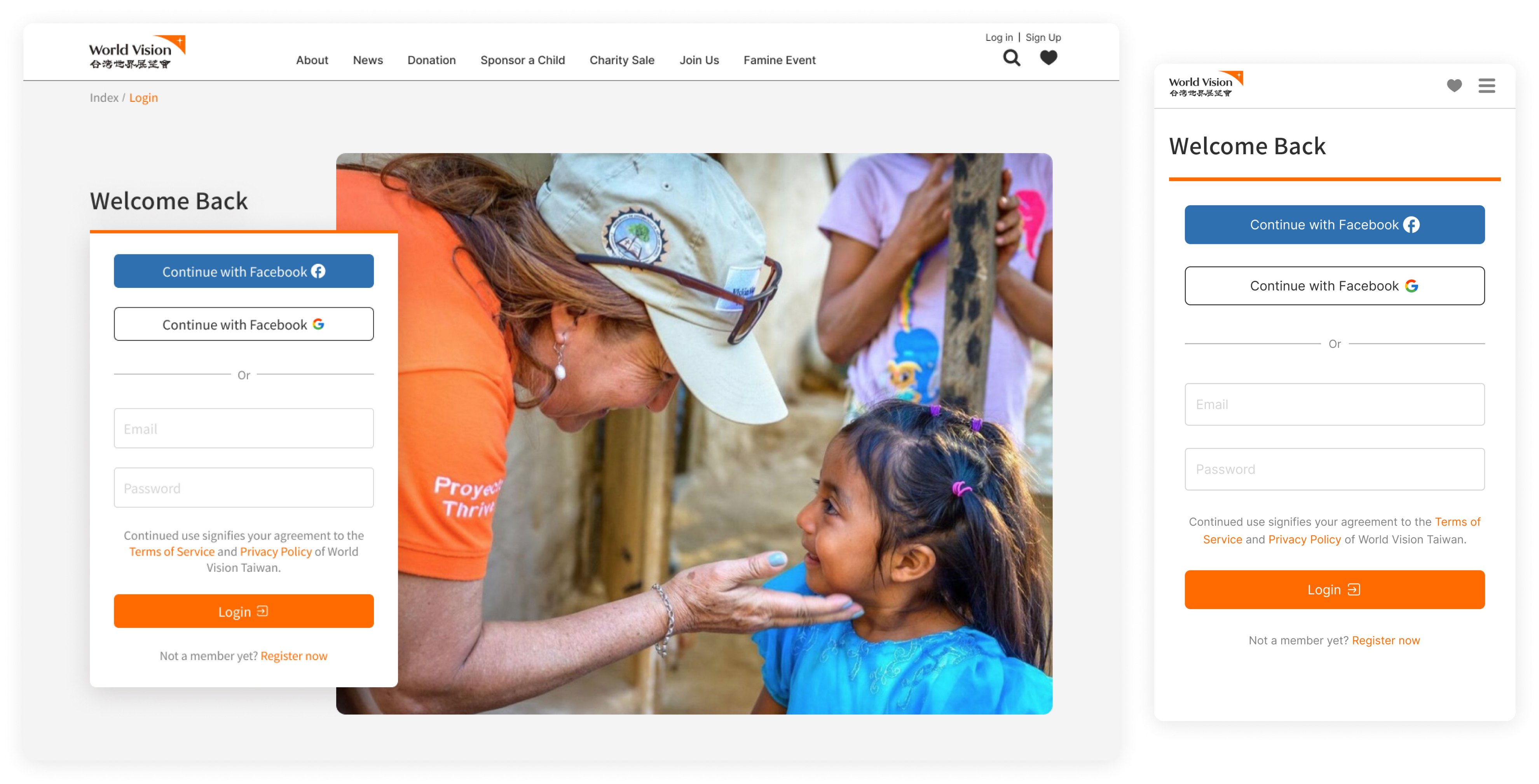
Streamline sign in process
For users who opt for recurring donations, storing banking information in the membership system is necessary. However, in the current registration process, users are required to input a large amount of non-essential personal information, leading to many users abandoning the process.
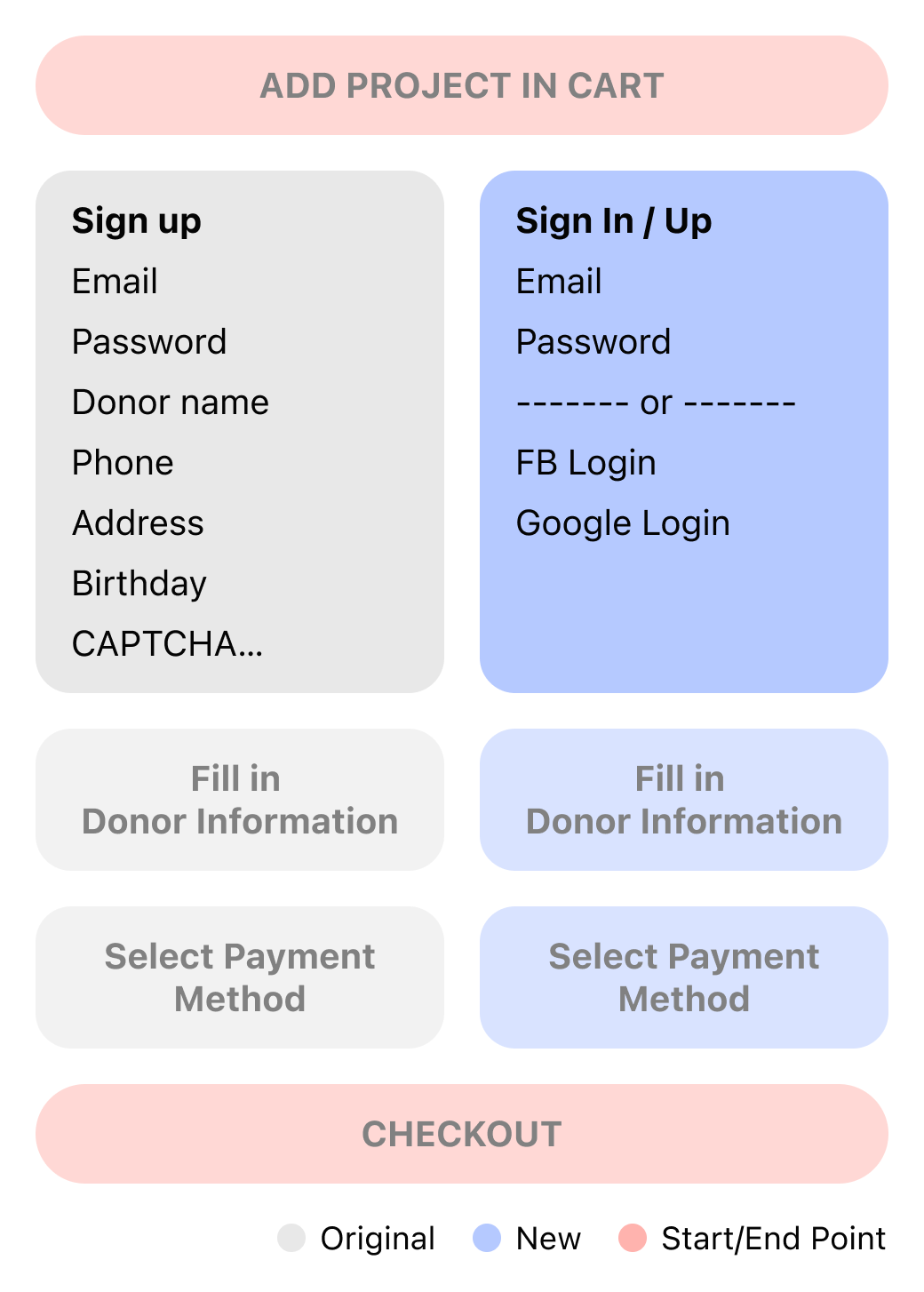
Introduce Social Login
Single sign-on is a common and straightforward method to encourage users to become members of a site. Users can register without the need to provide excessive information. In the future, logging in will be as simple as clicking a sign-in button instead of manually entering their account and password.
What'd we do?
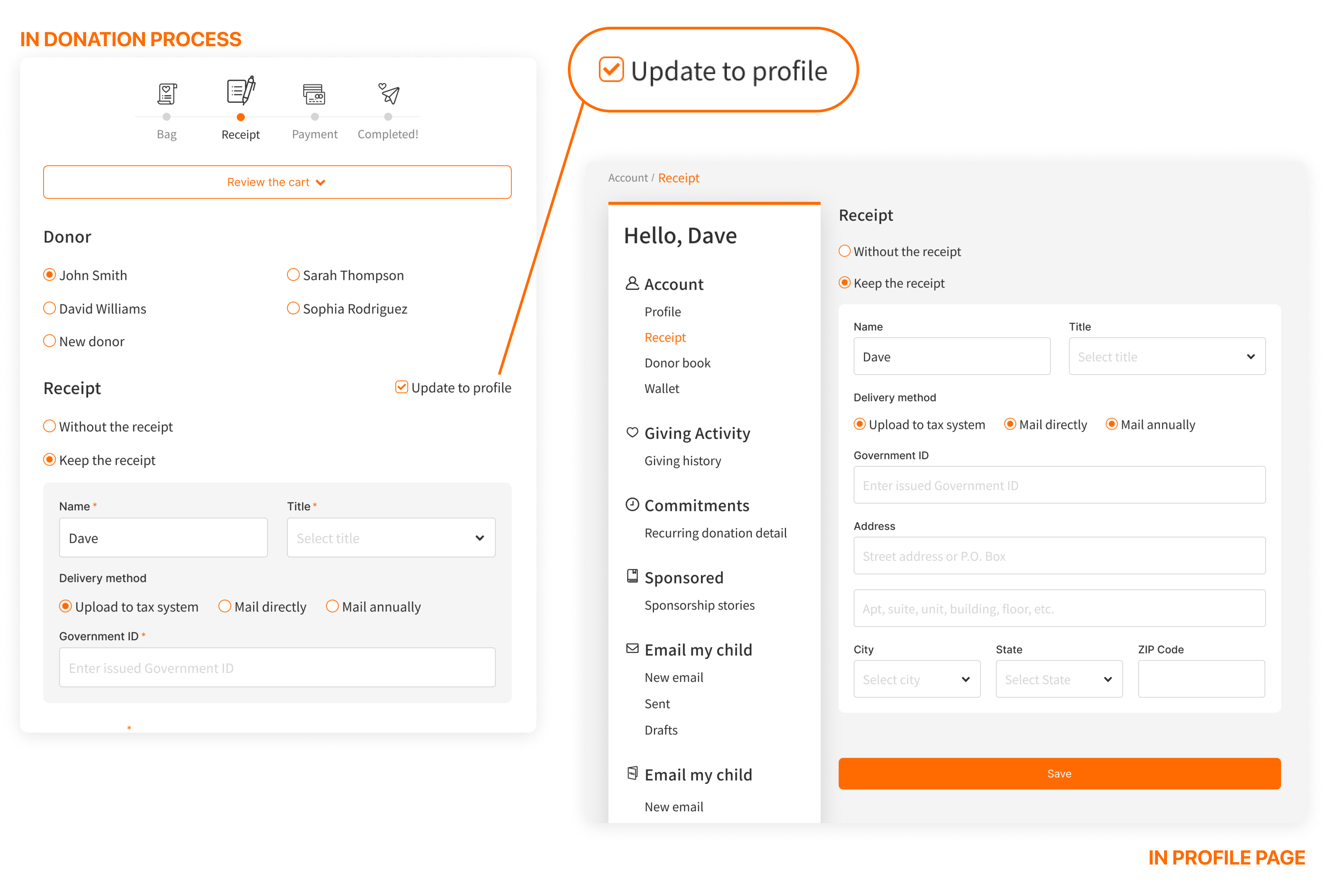
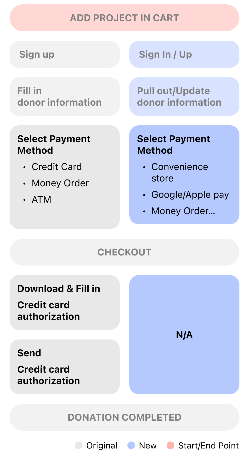
Simplify CHECKOUT PROCESS
Even though we streamlined the sign-up process, allowing users to make donations without filling in excessive information, some details are still required for recording and analysis. The original design separates user data in the donation process and profile page, which makes data inconsistent and requires users to manually fill in personal information in every donation.
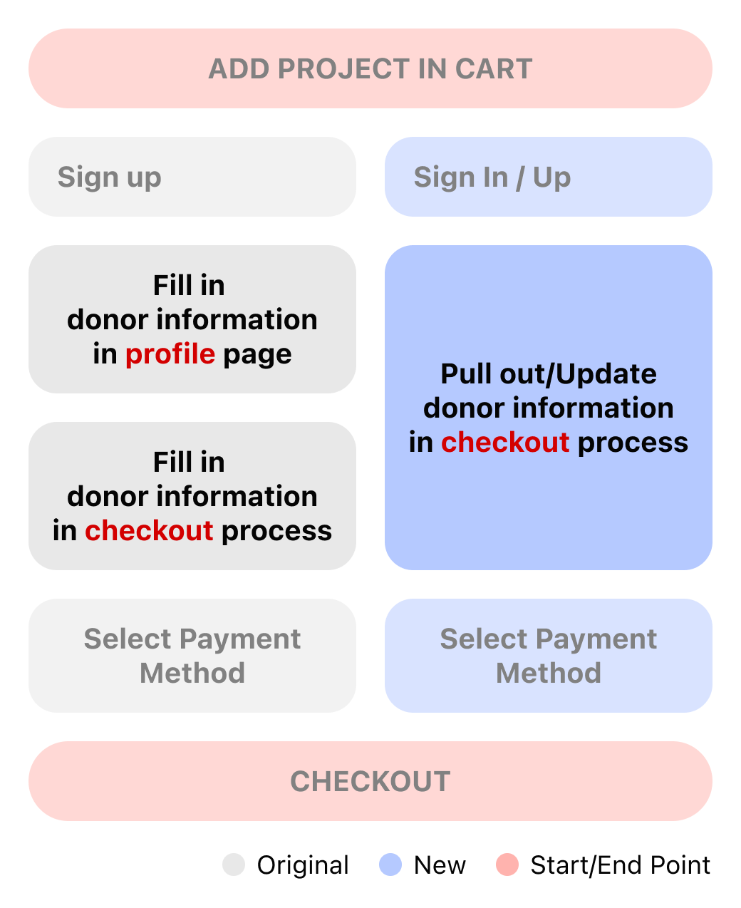
Automatically save member information
For first-time donors, it is necessary to provide personal information, which will be automatically stored in our database and retrieved during the subsequent donation process. Users can choose not to update information based on their preference.
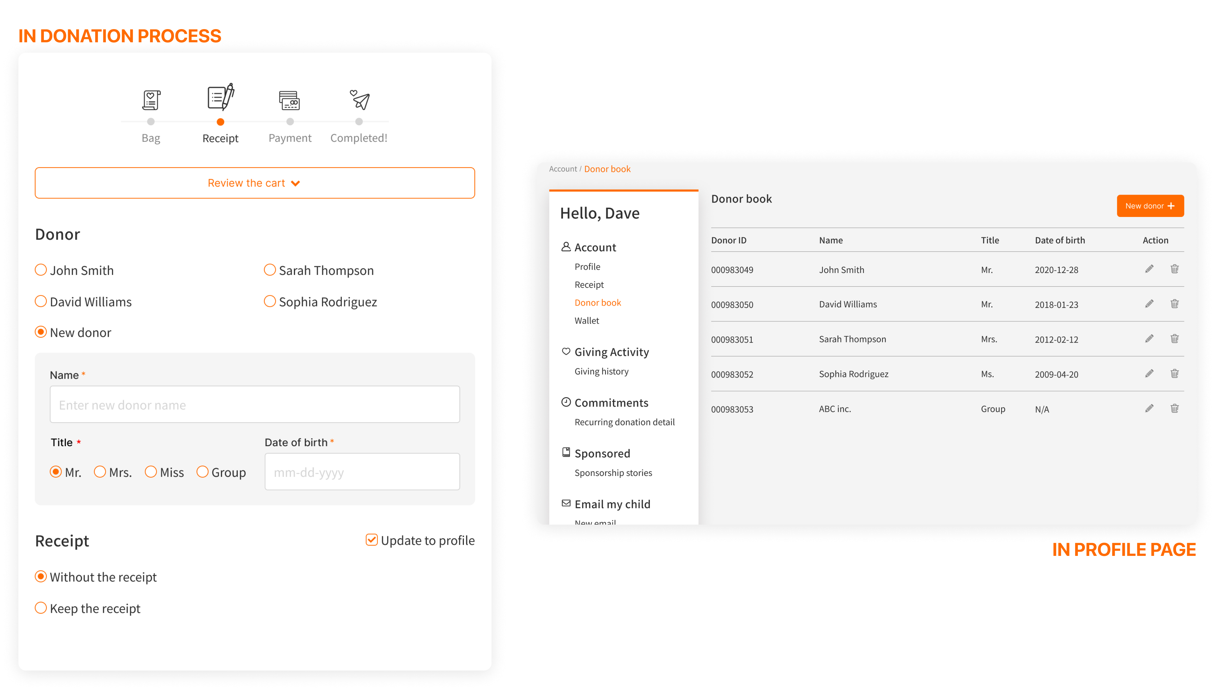
Allows users to manage donors info. directly
FBesides, we noticed that some users expected to donate by using others' names. Therefore, we invented a feature called "Donor Book". Users are able to edit other donor information as they want and automatically fill in/remove/add/revise in the donation process or member profile pages.
What'd we do?
IMPROVE PAYMENT EXPERIENCE
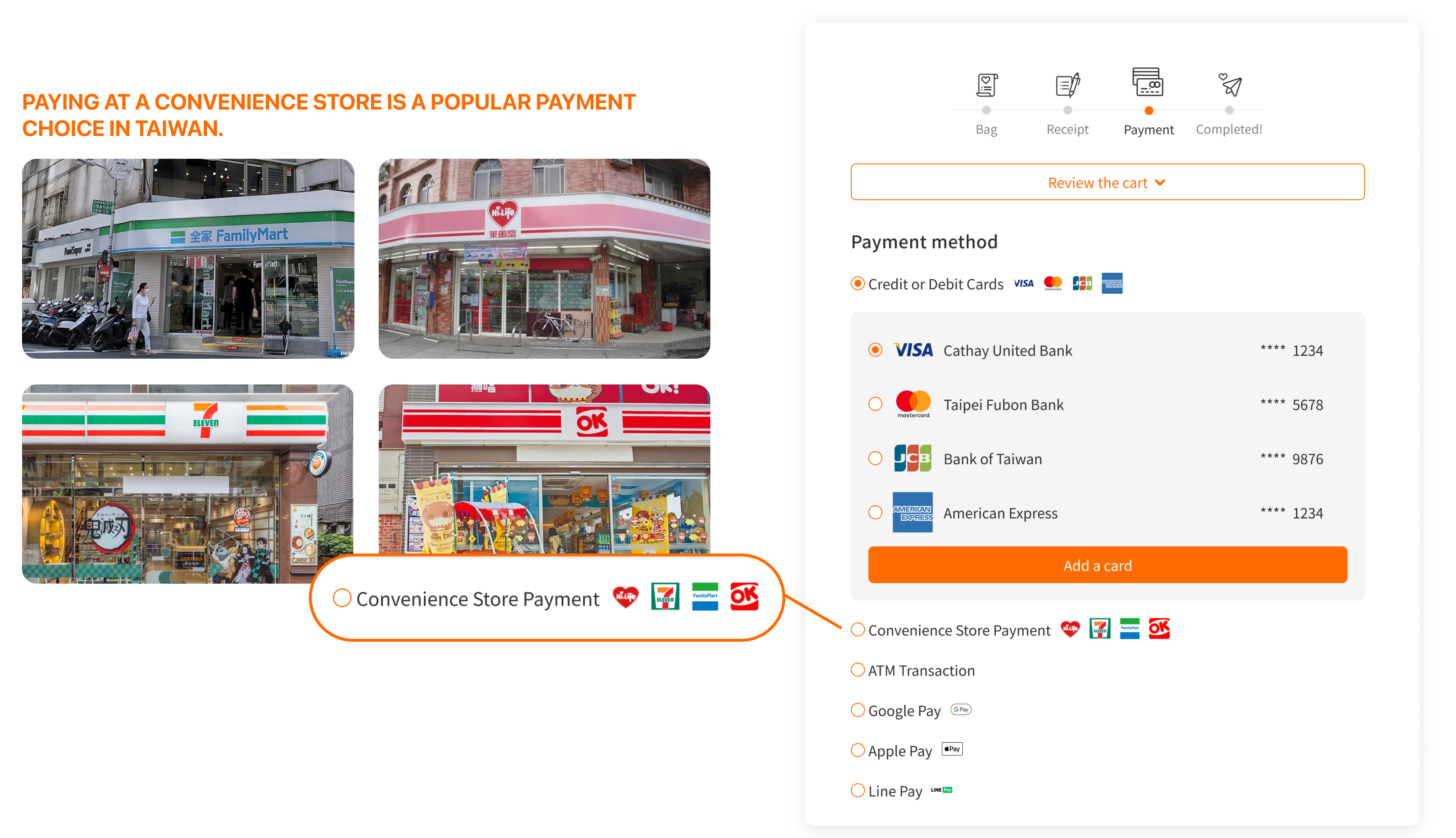
The system currently offers a limited option of payment methods for users within the existing payment flow. This necessitates users to mail a credit card authorization form to the World Vision office. This not only creates additional, unnecessary tasks for users but also increases the workload for the financial unit personnel at World Vision.
Make a payment at convenience stores
Going back to the main point, one big difference in how Taiwanese people handle payments is their preference for using convenience stores. Besides popular online methods, they find it easy to pay bills at these stores. Research shows that, on average, a Taiwanese person goes to a convenience store every two days. These stores are in really convenient spots, like near train stations, bus stops, and busy streets. People use it not just for buying food but also for paying bills and getting help from the staff, like taking care of trash. I'd say convenience stores in Taiwan are like magic—they can handle almost anything you need.
Other Deliverables
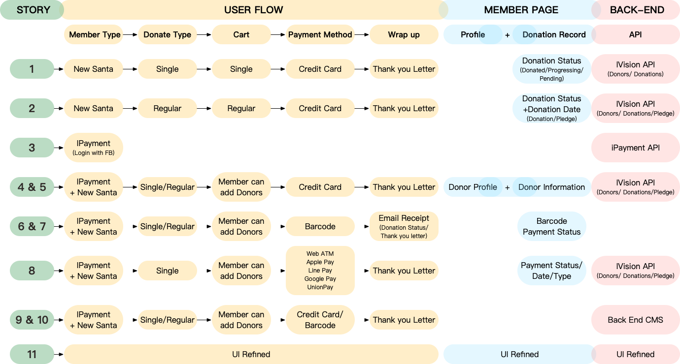
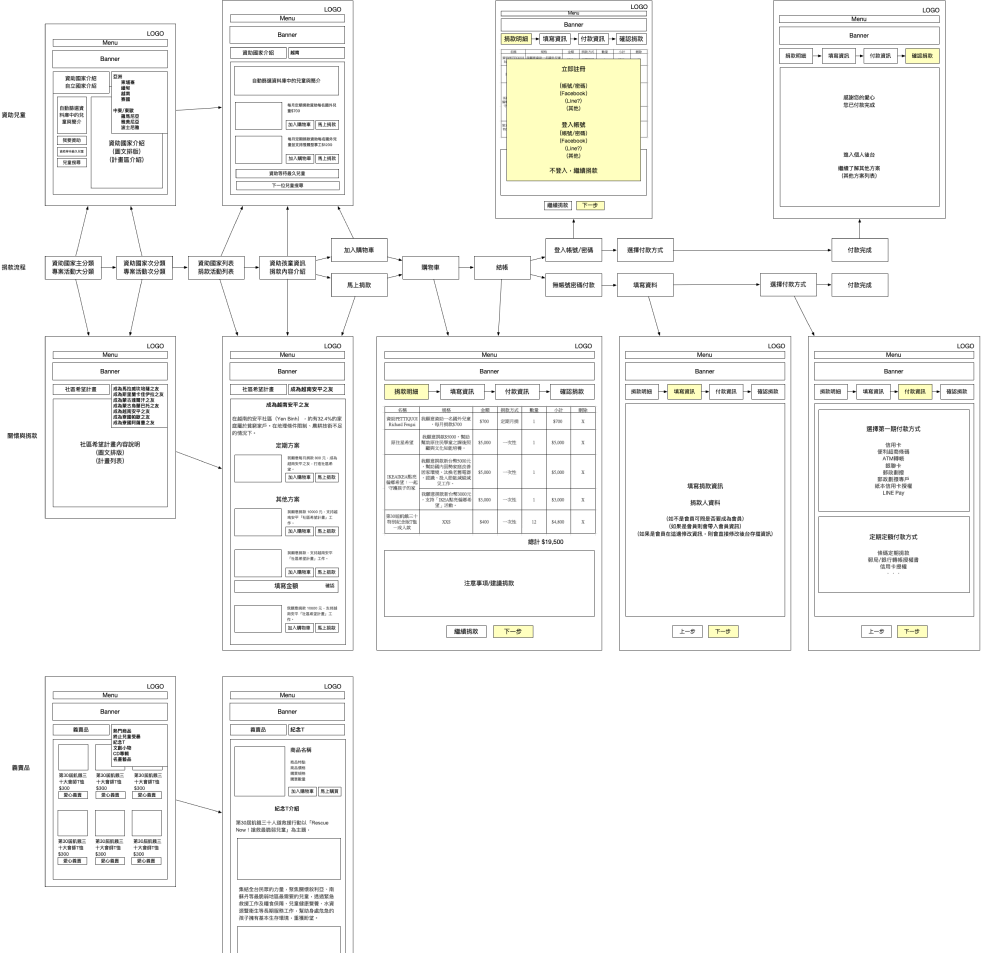
User flows diagram
By utilizing the User Flows Diagram, we've enhanced the donation experience on our website. This visual representation not only clarifies the user journey but also fosters clear communication among team members, enabling a user-centric design approach. It serves as a dynamic guide for developers, ensuring accurate implementation and allowing for continuous iteration based on user feedback.
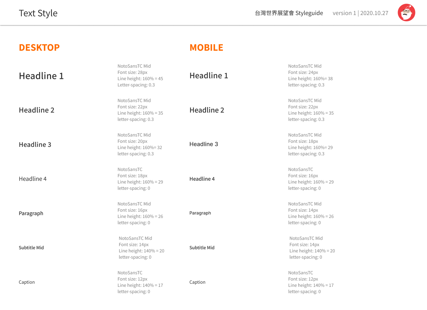
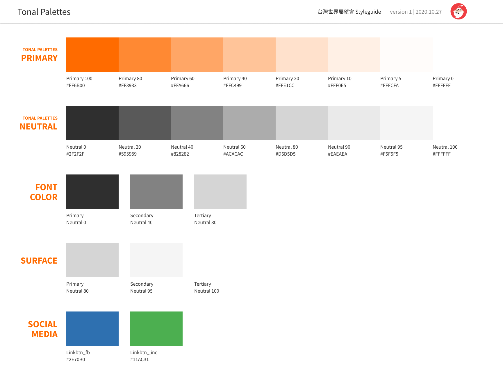
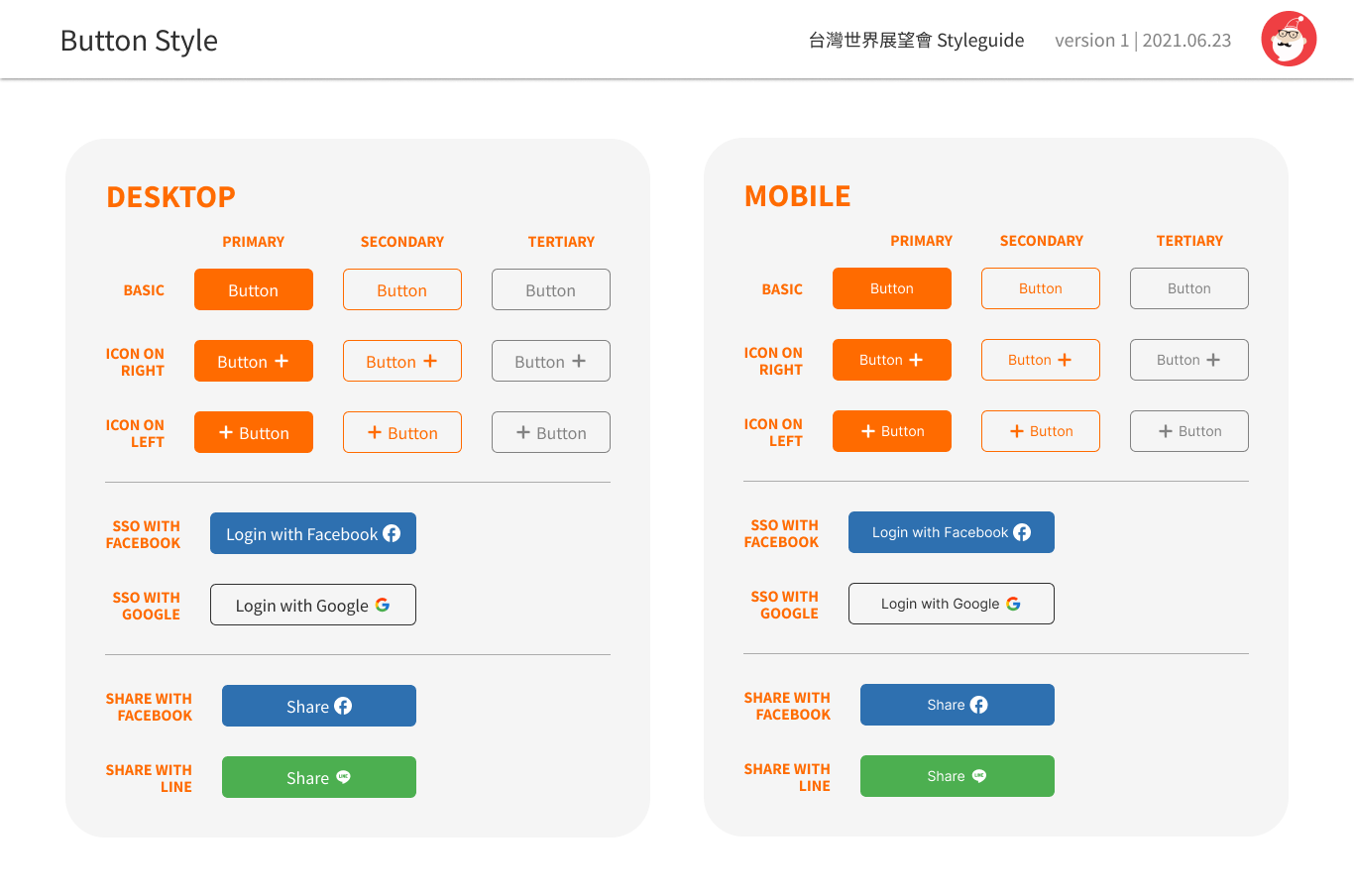
Design system
The vast scale of the project mandated the arrangement of a multitude of components within the system. To promote uniformity across all applications, each component featured distinct variations tailored for desktop, tablet, and mobile devices as needed.
Reflection
In leading the UX/UI design for World Vision International (Taiwan), I played a pivotal role in optimizing the website's donation experience. Recognizing distinct donation habits among Asians and Westerners, our team executed 16 Agile sprint iterations for continuous improvement. Despite the initial challenge of limited usability testing, we leveraged existing user data and outsourced insights. Identifying issues through cognitive walkthroughs, we streamlined the sign-in, simplified checkout, and improved payment processes. The result was a 50% increase in annual revenue post-launch in 2022. The User Flows Diagram proved indispensable, fostering communication, guiding development, and ensuring a user-centric design approach. Additionally, the design system maintained consistency across diverse applications.